ProEnergy
Improving Experience Through UX/UI
The deliverable? A new website that will appeal to their customers and future partners in the energy field. There are nuances to a website that is built for a more tight knit demographic.

Problem
ProEnergy is looking to modernize their website and logo in order to compete in an expansive market of energy production.
Process
After being briefed on the case study, I did my due diligence, researched the industry and competitors, and compiled a review of the existing state and possible solutions
Solution
Analyze and redesign the site in order to find creative partners in the energy field. Experience that is based on user-centric design, consumable information, and intentional interaction.
My Role
As the sole designer on this project I identified the target market, designed a solution, and tested prototypes to observe the solution's effectiveness. Through competitive analysis, mockup sketches, prototyping and designing I was able to design a viable solution for a more modern user -centric redesign. For the design to be thoughtful and well-executed it must be informed, so the first step was to conduct thorough research about the industry and the consumer, examine how other energy companies approach exhibiting their solutions and explore how leaders in the space are approaching it.
Empathy Mapping
Secondary research and competitive analysis gave me a better understanding of who I was designing for. Focusing on user pains, motivations, actions, and thoughts provided insight into the benefits of an improved search and checkout process. Here I have constructed an empathy map to better identify specific user needs and motivations.
Who are the users?
The user will be business partners and less so the general public, so the appeal of the website needs to be appealed to a more experienced crowd.

Userflow
After gaining a better understanding of the users motivations, behavior, and goals user flows and red-routes were identified. User flows were outlined to visualize the users journey, uncover bottlenecks, and provide insight into how people move through the site.
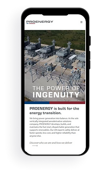
Wireframing and High Fidelity Design
The first iteration of high fidelity design began as I added brand color, typography, logos, and high quality photos. The first low fidelity mock-ups created were wireframes which I constructed using the basis of user flows, competitive, analysis, and user research. The wireframed red-routes were then converted into a functioning clickable prototype which I used to conduct guerilla usability testing.

Conclusion
The competition for entering the energy industry is intense. In industries that lack strong competitive differentiators between products. Users brand expectations and the experience they have while digitally interacting with a company can be deciding partnering factors. Future direction would be to continue rounds of usability testing interspersed with fresh iterations of high fidelity screens and prototypes to be reviewed and tested.